ANXIETY, 2019
18” x 24”
digital print
Moe critiques contemporary consumerism through a grocery aisle stocked with parody products.
We invite you to jump in…

“Spit in my Mouth”
2L Bottle
“ANXIETY”
Bottle
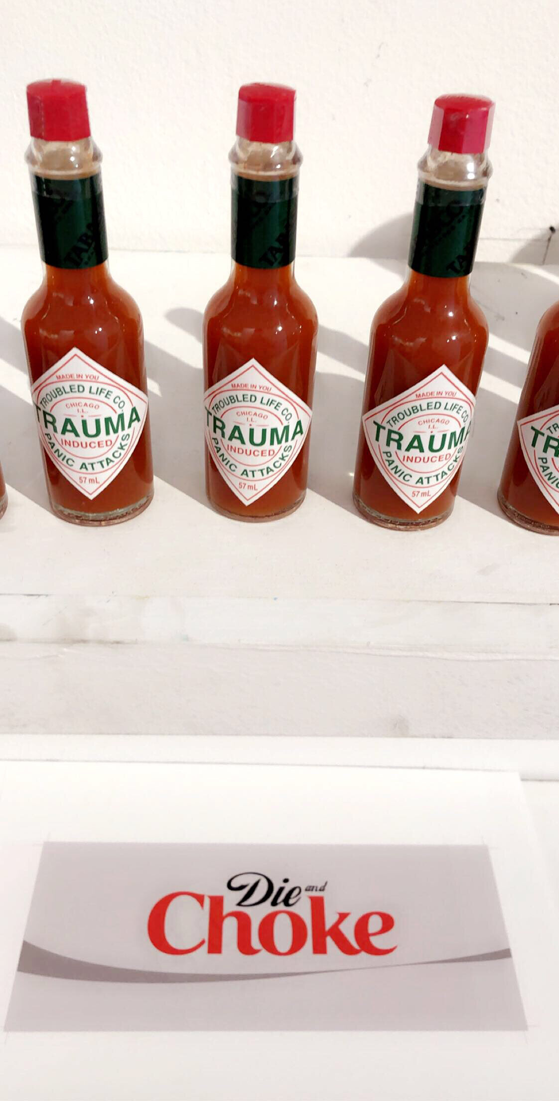
“Die and Choke”
2L Bottle
“Mania”
Instant Ramen Cup
“TRAUMA”
Hot Sauce Bottle
“Nuisance”
Brand Cigarette Carton
“Miserable”
Brand Cigarette Carton
“Control Yourself”
Brand Cigarette Carton
“Growing up in severe poverty, I wasn’t able to afford fresh produce or nutritional foods. My family found ourselves committed to brands we’d find in a local Dollar Tree or Cermak.
My mother worked at Jewel Osco where her employee discount barely kept us afloat. As I find ways of survival in what is now considered late-stage capitalism, I still find myself bound to certain brands and products that once barely kept me from starving, as well as a solidarity amongst a class of people I can never be separated from.
In my series titled In Poor Taste, I explore topics such as mental health, addiction, and distress through satirical redesign of popular and nostalgic brands and products you can find at your local grocer or corner store.”
-Moe C. Hibbard
Moe holds a BA in Graphic Design from Columbia College Chicago.
Conversation with Moe:
How would you describe your installation and what do you want them to take away from your installation?
I would say it's like an uncanny valley if it was a supermarket. Seeing it be brought to life makes me reminiscent of low-cost markets in the neighborhoods I frequented or grew up in.
I'm sure to a lot of my audience it might just seem satirical and funny and maybe even trendy, but personally I feel nostalgic.
Something I hope visitors can take away is a sense of familiarity and solidarity, especially those who experienced poverty in their lives. We become desensitized to our issues when surrounded by people who face the same problems, not realizing that the side effects of poverty are not just common accidents.
My exhibit is not to bring awareness to those who have never experienced being below middle class, nor to explain anything to them. I really just want others to know that we didn't starve alone.
What was your experience with this exhibition and what were some of the challenges you faced?
It was going very well in the beginning! I had wonderful communication with my installation team and they were both very insightful and creative.
Of course, then the gallery had to close until further notice and the pandemic did not ever get much better so unfortunately, I was never able to return in person, but with cooperation with the curating team it seemed to work out very nice.
Something I realized when trying to form content for the physical world was that I have never had to reimagine my work outside of two dimensions. I thought I had enough content to fill a space, but I couldn't help but feel it was so empty some of the time. Regardless I am ever so grateful to Evan, Bob, Yuxin, and Micki for helping me get out of that mindset and making my work come to life.
How has the process of this installation transformed the way you think about your work and will you consider a more immersive medium for your artwork in the future?
Making my work three dimensional was honestly very odd. I have always worked in two dimensions and never really thought there was room for my interests in the 3D world. I'm not sure if I want to continue creating in 3D.
Lately I've been working in some cute and fun crafty mediums and I'm hoping to bring my brand into those mediums, but still not really certain on any other ways. At the end of the day, I'm still just a graphic designer surviving a job crisis during a global pandemic.
Installation Process:
Moe began by selecting labels from their collection of parody products that would be found within the installation’s store.


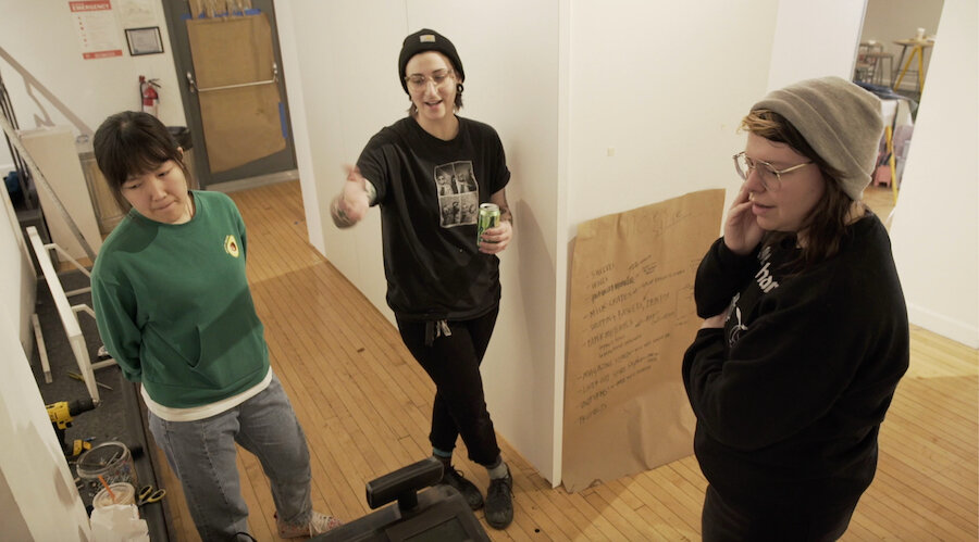
Moe met with the Hokin team in the gallery space to plan an installation that would simulate a supermarket. The team also began attaching the label prints to the recyclables collected.
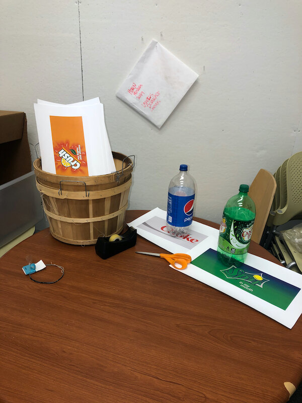
Once the layout was fit to the designated area of the gallery, Moe created store signs and price labels for each item with the “Juul Osco” brand aesthetic.


The Hokin team installed shelves to display Moe’s products and adhered each product label to recycled containers. As the installation progressed, Moe and the team added a false refrigerator door, shopping baskets, and conveyor belt to further emulate the experience of shopping at a supermarket.
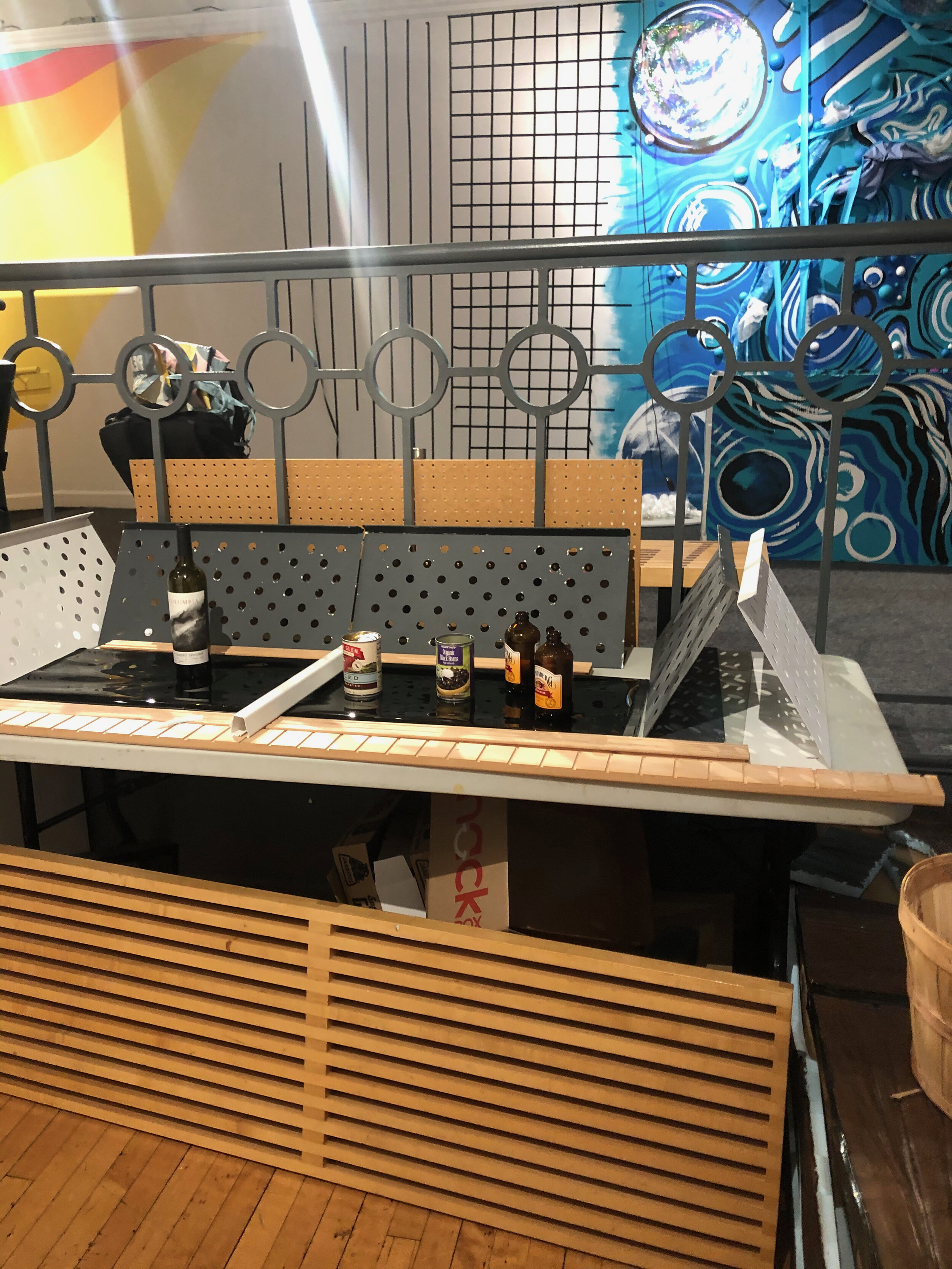
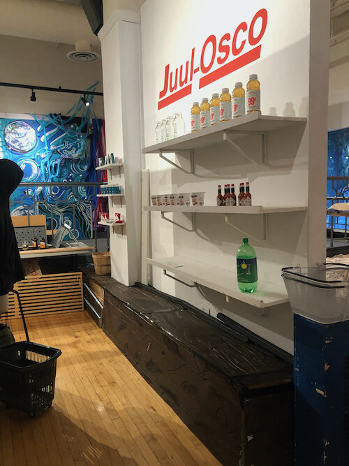
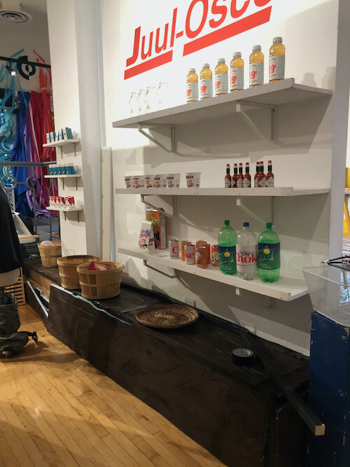


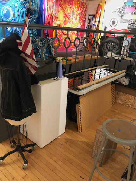
The team hung Moe’s final signage, modified parts of the design to be more minimalist, and crafted a checkout lane with custom-cut wood.


